How to Select the Best Data Visualization Chart
- Ogbuzuru Kelechi
- Apr 4, 2023
- 3 min read

As they may effectively summarize enormous volumes of data in a graphical style, data visualizations are an essential part of a data analysis.
Although your data may function with a variety of chart types, it's up to you to decide which one will guarantee that your message is accurate and understandable. Always keep in mind that data is only useful if it can be seen and given context.
What message does your data communicate?
Understanding why a chart is necessary is crucial before creating one. People may better understand complex data, discover patterns, spot trends, and convey a story by using charts, maps, and infographics. Consider the point you wish to make to your audience.
Take a look at the information below: It doesn't make sense.

Take a look at the following details: This is understandable (because of visualization)

Advantages of visualization:
It assists us in communicating the correct message to the audience through visualizations.
It aids us in identifying outliers in our data.
It assists the corporate leader in making sound decisions.
It aids us in understanding how information circulates throughout time.
Types of Charts and Graphs
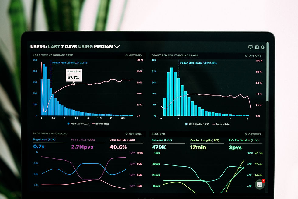
Bar Chart
One of the most popular data visualizations is the use of bar charts. With their aid, you may swiftly compare data from other categories, draw attention to differences, display trends and outliers, and quickly determine historical highs and lows. When data can be divided into several categories, bar charts are extremely useful.

Line Chart
The line chart, also known as a line graph, connects a number of different data points and displays them as one continuous progression. To see data trends, typically across time, use line charts (like stock price changes over five years or website page views for the month). The end result is an easy-to-understand method for visualizing changes in one variable in relation to another.

Column Chart
You can use column charts to display data about subsets of a larger whole across many categories in both absolute value and relative terms. The terms "stacked column chart" and "100% stacked column chart" have been adopted.

Scatter plots
The correlation between the data points that might not be obvious from the data alone can be seen using scatter plots.
It is utilized for showing and contrasting numerical quantities, such as data from research or statistics.

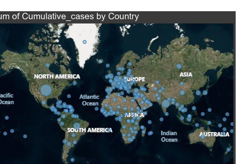
Maps.
For visualizing any kind of location data, including postal codes, state abbreviations, country names, and your own custom geocoding, maps are a no-brainer. Maps are an easy and effective approach to demonstrate how geography connects with patterns in your data if you have geographic information linked with your data.
Pie Chart
Pie charts are effective for giving other visuals more detail. A pie chart by itself does not provide the user with a mechanism to rapidly and accurately compare data. The viewer must provide their own context, therefore important elements from your data are overlooked. Try using pie charts to drill down on other visualizations rather than making them the centerpiece of your dashboard.

Donut Chart
With the hole in the middle, it is a modified pie chart.
Instead of slices, it shows the categories as arcs.

Histogram
It is utilized to plot frequency over a distribution. In the area of analytics, it is a highly helpful graph that may draw many insightful conclusions from the data. Visually, there is no room between any of the bars; they are all touching.

Box plot
It's also referred to as the Box and Whiskers Plot.
The median value appears as a line through the center of the box. In other words, 50% of the data are above the median value, and 50% are below the median value.
Because medians are less influenced by outliers than mean is, they are valuable.
25% of the data are above the median and 25% are below the median within the box itself, which means that 50% of the data are contained within the box.
With this graphic, we can quickly identify outliers and the plot's distribution.

In conclusion
The type of variables you are looking at and what you hope to learn from them will determine the best chart for the job. You must choose the option that will ensure the clarity and accuracy of your communication.


Comments